Shattered on Purpose: How Fragmented Web Design Became the Aesthetic of Our Moment
Open almost any independent creative portfolio right now and you'll notice something that would've gotten a design student failed five years ago. Text bleeds off the edge. Images stack on top of each other without apology. A serif font from what looks like a 1970s paperback sits next to a brutalist sans-serif that feels like it belongs on a construction warning sign. And somehow — somehow — it all works.
Fragmented design is everywhere, and it didn't sneak up on us. It arrived loudly, messily, and with complete intention.
The Grid Was Always a Cage
For a long stretch, clean grid-based design was the gold standard. Responsive layouts, consistent spacing, harmonious color palettes — these weren't just preferences, they were basically commandments. The logic made sense: a structured interface is easier to navigate, easier to build, and easier to scale. Tech companies leaned into it hard. So did e-commerce. So did every startup that wanted to look "trustworthy."
But here's the thing about commandments: eventually, someone starts questioning them.
Designers who came up making zines, doing collage work, or building personal sites on early web platforms like GeoCities or Angelfire never fully bought into the idea that tidiness equaled quality. They remembered a version of the internet that felt handmade — unpredictable, a little chaotic, deeply personal. And as the corporate web got smoother and smoother, that roughness started to feel like something worth chasing.
"There's a certain deadness to a perfectly optimized page," says one Brooklyn-based designer who builds experimental portfolio sites for musicians and visual artists. "You can feel when something was made by a committee or run through a template. The fragmented stuff — even when it's uncomfortable — feels like a person actually touched it."
Collage Logic, Browser Canvas
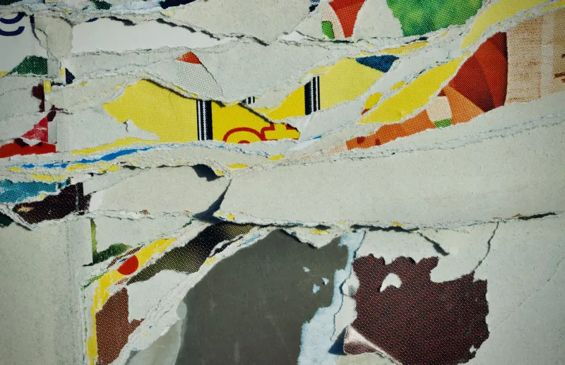
The language of collage — tearing, layering, juxtaposing things that don't quite belong together — translates surprisingly well to the browser. CSS has evolved to the point where designers can do things with layering, masking, and positioning that used to require hacks and workarounds. Tools like Webflow, along with a renewed interest in hand-coded HTML and CSS, have made it easier to build sites that look like someone took scissors to a magazine and reassembled the pieces at a slight angle.
The visual vocabulary is distinct: overlapping image containers, text that interrupts other text, navigation that doesn't sit neatly in a header, color blocks that don't respect their boundaries. It borrows from print design, from street art, from the kind of editorial layouts you'd find in an art school magazine from the early 2000s.
What makes it feel current rather than nostalgic is the intentionality. This isn't a designer who didn't know how to align things. It's a designer who aligned everything perfectly and then deliberately knocked it sideways.
The Corporate Smooth-Out and the Backlash It Deserved
It's hard to talk about why fragmented design resonates without talking about what it's reacting against. The last decade of mainstream digital design has been characterized by what you might call algorithmic smoothness — interfaces optimized for conversion, engagement, and frictionless use. Everything rounded, everything sanitized, every rough edge filed down.
Social media platforms started looking like each other. Apps started looking like social media platforms. Personal websites started looking like apps. The homogenization got so complete that a portfolio site for a painter and a landing page for a SaaS startup could, in theory, share the same template and nobody would blink.
For creators who are trying to communicate something specific about their work — something that's actually theirs — that sameness is a problem. A fragmented layout is, among other things, a refusal. It's a site saying: this was not made by a template, and you cannot skim it the way you skim everything else.
"People have trained themselves to absorb information from clean layouts without really seeing it," says a developer and digital artist based in Los Angeles who builds what she describes as "sites that misbehave." "When something breaks that pattern — when the layout doesn't behave the way you expect — you actually have to look. That's the whole game."
Where Code Meets Cut-and-Paste
What's particularly interesting about this moment is the overlap between traditional collage-making and front-end development. Some of the designers doing the most compelling fragmented work are people with one foot in analog art practice and one foot in code. They're thinking about a website the way a printmaker thinks about a page — as a surface with layers, tension, and texture.
There's a growing community of creators who share their process openly, posting screenshots of their CSS alongside photos of the physical collages that inspired a layout. The conversation between those two practices — cut paper and written code — is genuinely productive. Collage has centuries of theory behind it: the meaning that emerges from unexpected juxtaposition, the way context shifts when you remove an image from its original frame. Applied to web design, that theory gives the aesthetic a depth that pure visual trend-chasing doesn't have.
It also produces work that ages differently. A site built on a clean, trendy template can look dated within two years as design conventions shift. A site that's deeply personal and visually specific tends to feel timeless in a different way — not because it's classic, but because it's so clearly a record of a specific person's thinking at a specific moment.
The Human Fingerprint
At the core of all this is something pretty simple: people can tell when something was made by a human. Not always consciously, not always immediately, but there's a quality to handmade things — digital or physical — that registers.
Fragmented design is one way of leaving that fingerprint visible. The asymmetry, the tension, the sense that elements are in conversation (or argument) with each other — these are qualities that don't emerge from automation. They require judgment calls, aesthetic risk-taking, and a willingness to sit with something uncomfortable until it resolves into something true.
That's not a workflow. That's an art practice.
And as more creators build their own corners of the web — personal platforms, portfolio sites, experimental digital spaces that don't answer to an algorithm — the demand for design that reflects actual human sensibility is only going to grow. The grid will always be there for whoever wants it. But the designers tearing it up and rearranging the pieces? They're onto something.