Rough to the Touch: How Digital Design Fell in Love With Things You Can Almost Feel

Photo by Photo by Appdrawn Team on Unsplash on Unsplash
Open up a design portfolio from 2017 and you'll notice something: everything is very, very clean. Flat icons. White space that goes on forever. Sans-serif type that looks like it was drawn by a machine that had never once been outside. It was a specific kind of beautiful — precise, frictionless, and almost completely devoid of warmth.
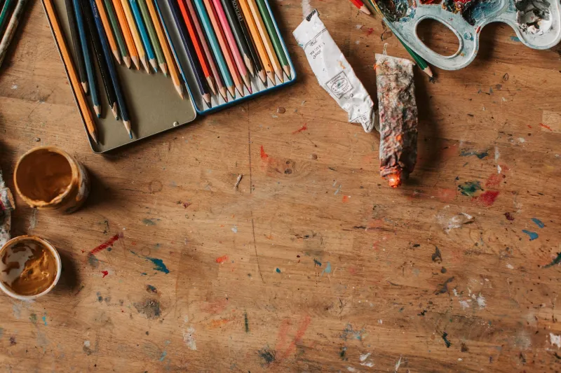
Now open up what's getting attention in 2025 and you'll find something else entirely. Risograph textures bleeding through type. Linen backgrounds with visible thread counts. Handwritten annotations that look like they were actually scrawled in the margins of something physical. Concrete. Rust. Worn denim. Paper that looks like it's been folded and unfolded a hundred times.
Something shifted. And it's not a small thing.
The Minimalism Hangover
For about a decade, digital design was in the grip of a particular philosophy: less is more, and the less you can feel it, the better. Skeuomorphism — the design approach that made digital objects look like their physical counterparts — was declared dead and buried after Apple's iOS 7 redesign in 2013. Flat was the future. Texture was clutter.
The logic made sense at the time. Screens were getting sharper, devices were getting more powerful, and designers were rightly excited about what pure digital aesthetics could do without the crutch of real-world metaphor. The result was beautiful work that prioritized clarity and function.
But something got lost in the process. Digital spaces started to feel sterile. Interchangeable. Like every app, every site, every portfolio existed in the same frictionless void. Users could navigate effortlessly and feel absolutely nothing while doing it.
Texture is the correction.
What "Tactile" Means When Nothing Can Be Touched
Here's the strange thing about the texture movement: none of it can actually be felt. A wood grain background doesn't have grain. A canvas texture is still just pixels. The linen is a lie.
And yet it works. Research on multisensory design has long pointed to the fact that visual texture triggers real psychological responses — warmth, weight, age, handmade quality — even when no physical surface is involved. When you see something that looks like it has texture, your brain fills in the sensory gap automatically.
Designers leaning into this are essentially hacking that response. They're using visual information to create an emotional experience that purely flat design can't access. A portfolio with a rough paper background doesn't just look different from a white-background grid — it feels different. It implies a maker who works with their hands, who values the physical, who thinks about more than just the screen.
The Materials Driving the Moment
A few specific textures keep showing up across the design portfolios and digital spaces that are getting traction right now.
Risograph and screenprint grain. That slightly misregistered, ink-on-paper quality has become a signature of independent designers who want their digital work to read like something that came off a press. It suggests craft and limitation in a medium that technically has neither.
Handwritten typography. Not hand-lettering in the polished, calligraphic sense — actual handwriting, with the wobble and inconsistency of something written by a human in a hurry or in a quiet moment. It's legible enough to function and imperfect enough to feel real.
Natural materials. Wood, concrete, stone, linen, raw cotton. These are showing up as background textures, as UI elements, as the surfaces on which digital type sits. They bring an earthiness to digital spaces that had been scrubbed of anything resembling the physical world.
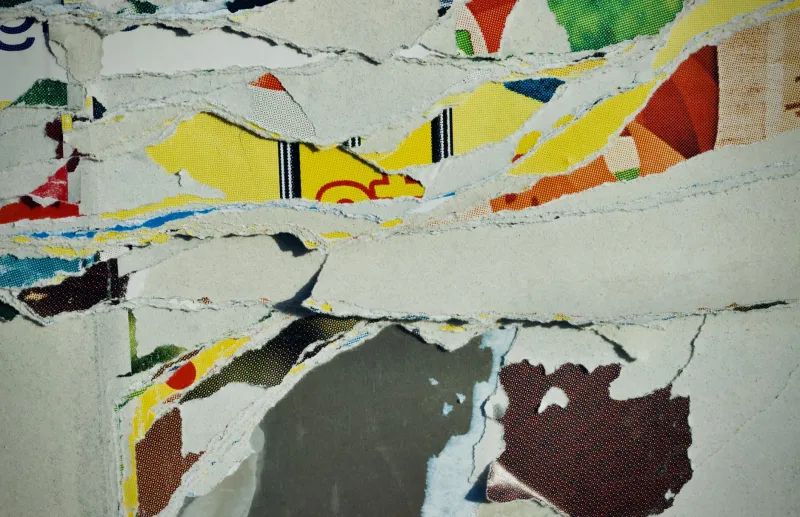
Aged and worn surfaces. Faded prints. Yellowed paper. Cracked leather. The aesthetic of something that has been used and loved for a long time. In a culture obsessed with the new, there's something quietly radical about designing for the feeling of age.
Why Now, Though?
The timing makes sense when you pull back and look at the broader cultural context. The pandemic years sent a lot of people into a much more physical relationship with their homes and their hands — sourdough, ceramics, embroidery, woodworking. The things you could touch and make and hold became suddenly, urgently important.
That appetite didn't go away when the world opened back up. If anything, the contrast between the richness of physical experience and the flatness of so much digital interaction became more obvious. Designers who came through that period with a renewed appreciation for material and texture brought it back into their work.
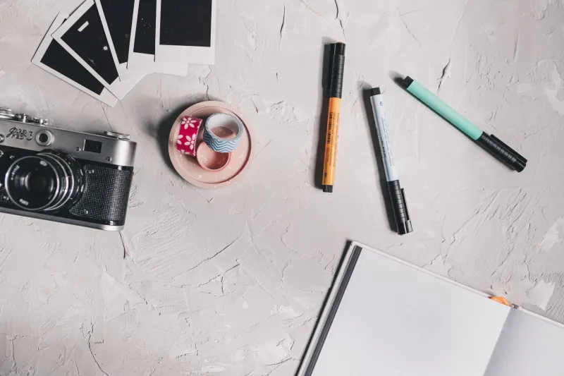
There's also a generational dimension. Younger designers who grew up entirely in the age of flat UI are actively drawn to analog references they didn't personally grow up with — zines, film photography, letterpress printing, mimeograph machines. The texture of those things reads as authentic precisely because it's not optimized.
Bringing the Body Back Into the Screen
What the texture movement is really doing, at its core, is insisting that digital design doesn't have to exist in opposition to the physical world. That screens can carry warmth. That a portfolio can feel like something you'd want to pick up and hold, even when that's literally impossible.
For creators building personal sites and digital portfolios, this opens up a genuinely exciting set of choices. The question isn't just what to show, but what your work should feel like to encounter. What material would it be made of, if it were made of something? What does it weigh?
Those aren't questions flat design ever asked. And the fact that so many creators are asking them now says something real about where digital aesthetics are heading — back toward the body, back toward the hand, back toward things you can almost touch.